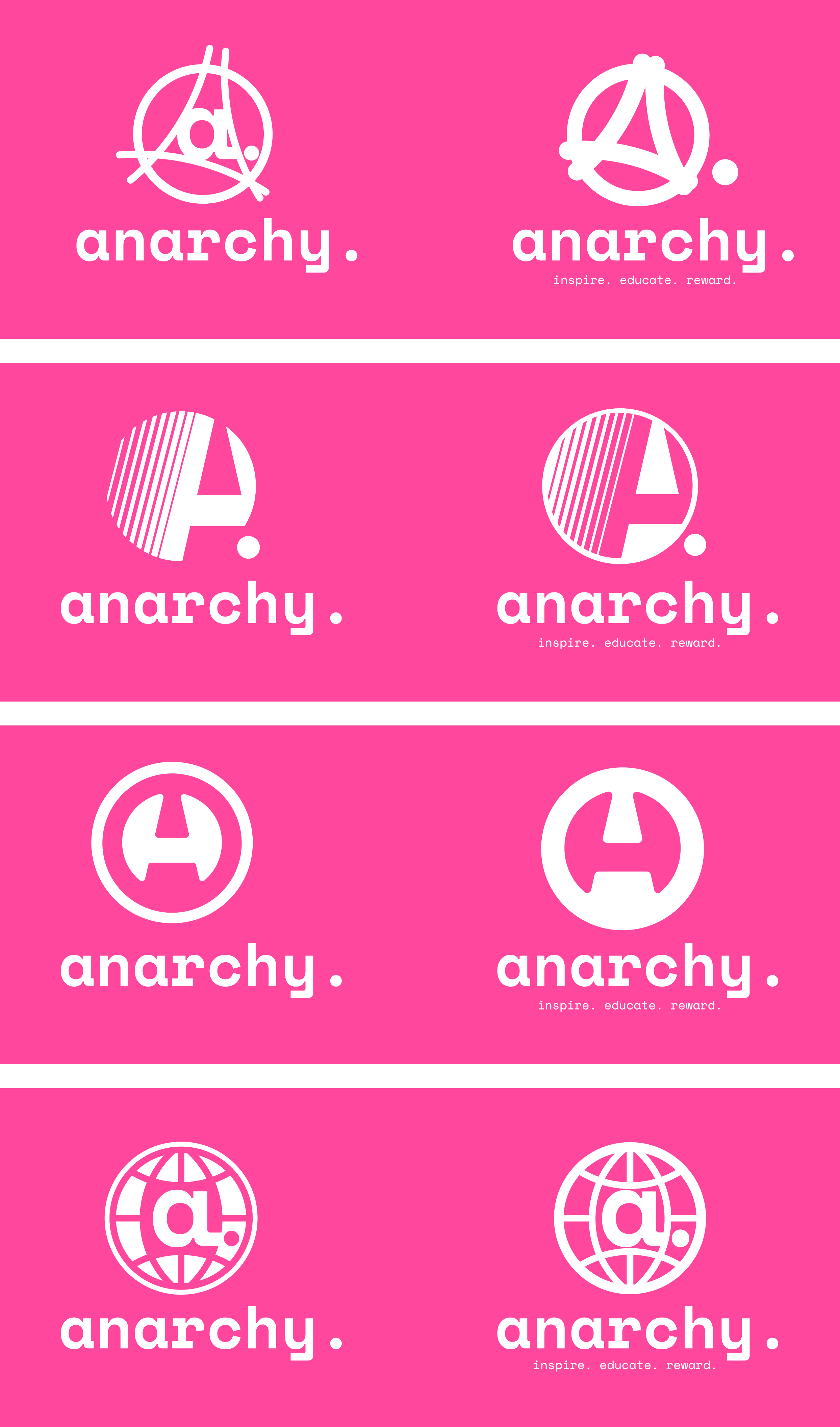
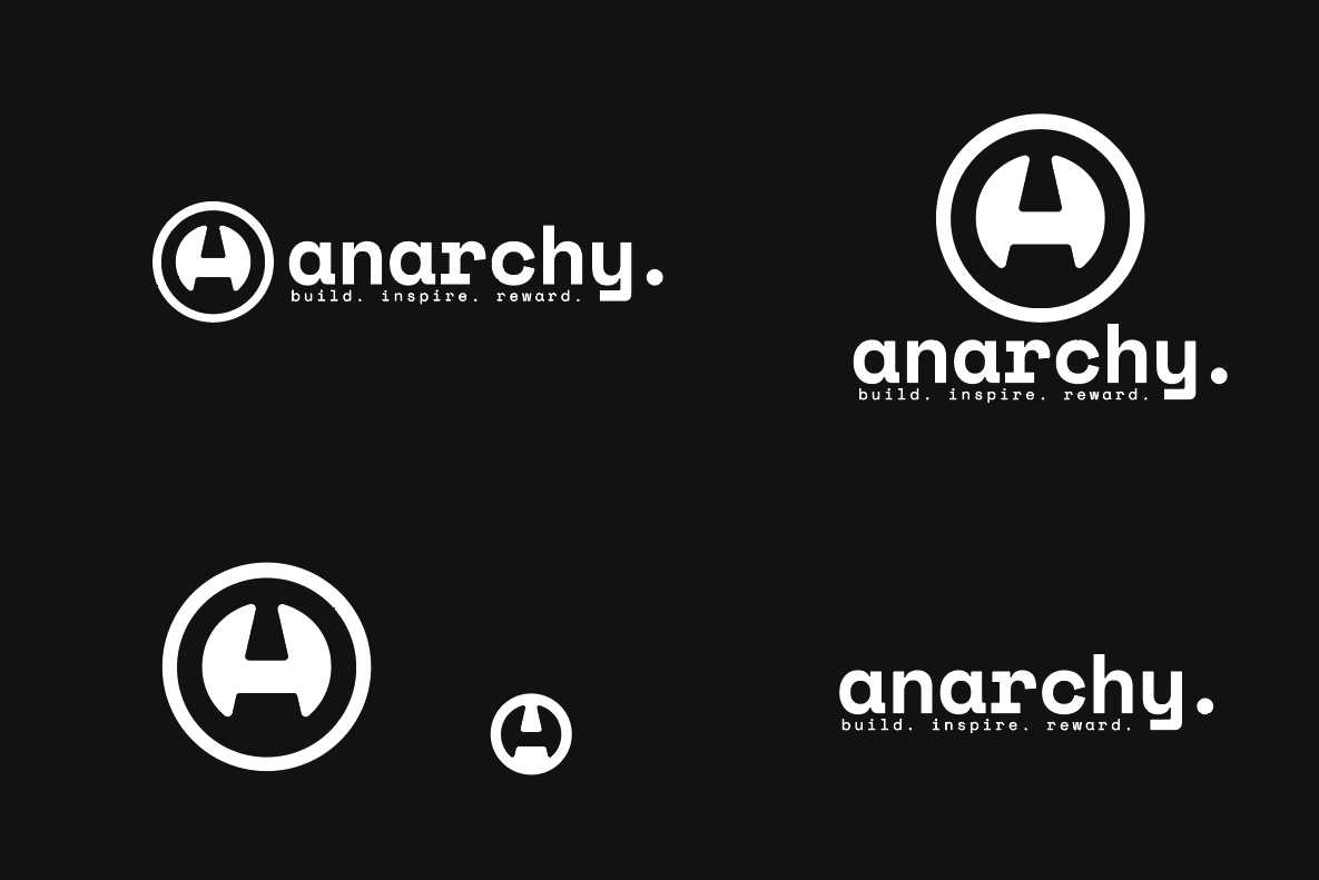
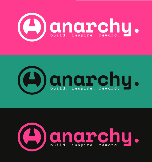
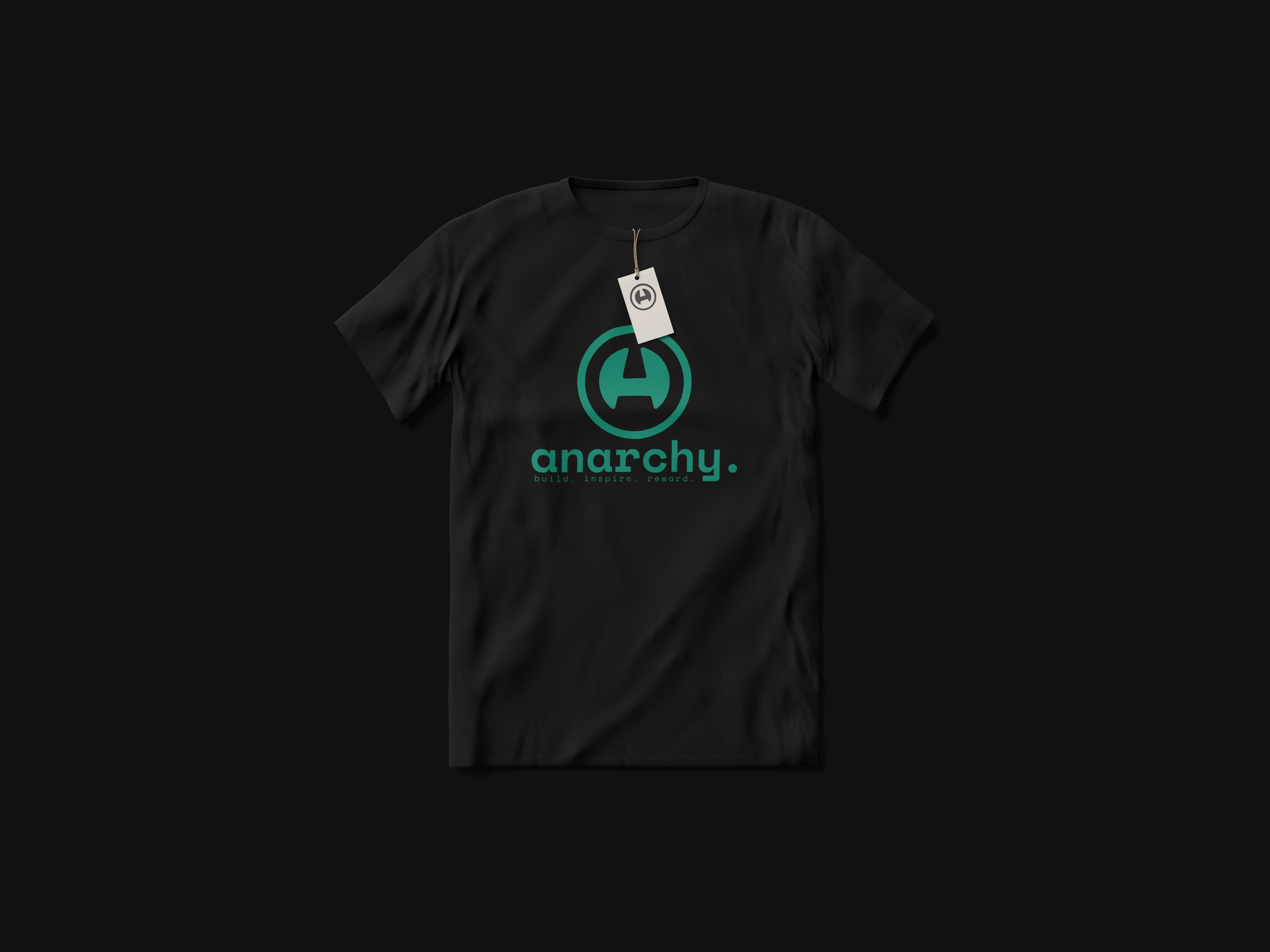
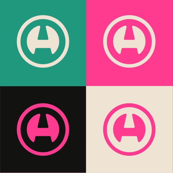
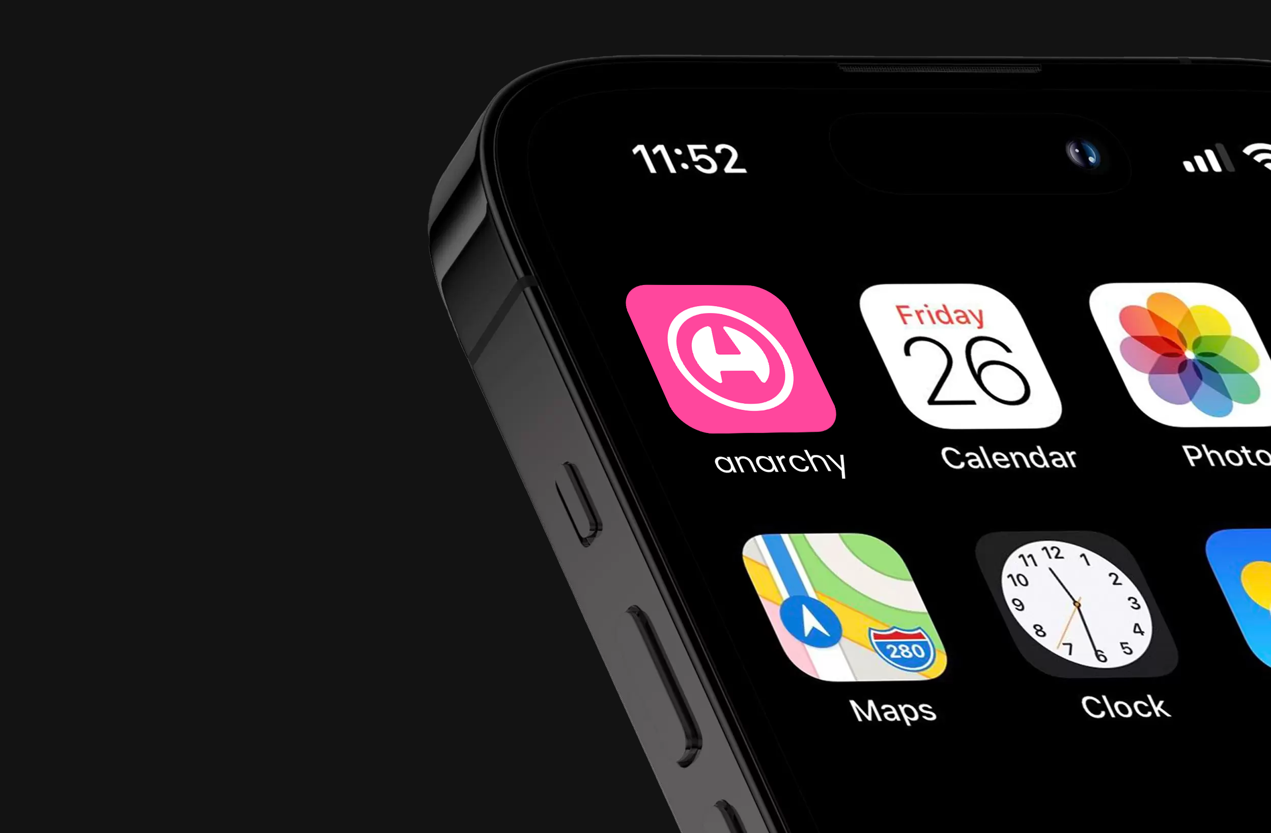
We partnered with Anarchy; a bold, community-led platform at the intersection of blockchain and AI creativity, to design a visual identity that could match their disruptive energy and vision. With a new name and a tight deadline ahead of their platform launch, they needed a brand that resonated with creators, innovators, and early adopters alike. We delivered a full logo suite, animated assets, and brand collateral that brought clarity, cohesion, and character to their mission. The result: a future-ready identity that’s as dynamic as the creative community they’re building.
Anarchy came to us with a bold new name and a bold new mission - but no visuals to back it up. Their existing brand didn’t match their ambition. They needed an identity that communicated the complexity of their platform: part-social, part-economic, part-creative. They were also under pressure to hit a hard deadline for launch, which meant our process had to be tight, efficient, and bang on the mark.
Oh, and their name was Anarchy. So it had to feel powerful, disruptive, but still polished enough to win over creatives and investors alike.
Project Name: Logo & Identity Rebrand
Timeline: 3 weeks
Scope:
A full-throttle rebrand. Anarchy were repositioning their original concept under a new name and needed a visual identity to match their updated vision.
Deliverables:
Research & Strategy
With a 3-week deadline, we hit the ground running. Anarchy came prepared, with a colour palette, brand ideas, and even a sketch from one of the founders. We used this as our north star, building a brief and timeline off the back of a focused discovery session.
Design Process
We started by breaking down the sketch, looking at why those lines existed, what story they told, and how we could evolve that language into something iconic. From there, we developed a range of iterations exploring form, typography, and balance until we hit the sweet spot.
Collaboration
Working with creatives building a platform for creatives meant input was insightful, sharp, and constant. To help streamline the process, we focused on regular check-ins and a modular logo suite. We provided multiple icon variants to allow space for intuitive decision-making, and one of them clicked instantly.
Final Design
A clean, modern identity that toes the line between rebellion and refinement. We delivered:
How It Solved the Problem
Anarchy now have a brand that reflects their mission. The logo is bold enough to stand alone in an app drawer, detailed enough to communicate purpose, and versatile enough for future rollouts. It reflects their counter-cultural values, their tech-forward foundation, and the creative community at their core.
Unique Features
The full suite was designed with UX adaptability in mind. Each version of the logo was built to work across a range of devices, use cases, and interfaces. The animation adds a layer of dynamism that feels right at home in the SaaS + blockchain space without leaning into clichés.
Quantifiable Results: Anarchy launched their new site on time, complete with full branding and motion assets. They’re now in beta with groups of creatives actively using the platform.
Long-Term Impact: With their new identity, Anarchy have gone from stealth startup to a fully branded, testable product with a growing community. We’re continuing to support them as they roll out the platform and scale their offering.